Graphics with Python: Difference between revisions
| Line 116: | Line 116: | ||
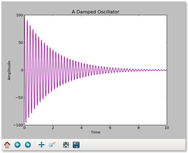
This is what it looks like: | This is what it looks like on the screen: | ||
<center> | <center> | ||
[[File: | [[File:Damped_cos_screen.png]] | ||
</center> | </center> | ||
Revision as of 22:21, 18 February 2013
The Python matplotlib module provides tools for interactive 2-D and 3-D graphics, and for saving plots in file formats you can easily display on the web or in other programs, print, and incorporate in documents.
Installation of matplotlib
The current version 1.2 may be included in some Linux distributions. Version 1.1 has most of the features you will need now, and it is in Ubuntu and OpenSuse packages that can be added to your core Python system after you also install numpy. For example, under Ubuntu you would use
sudo apt-get install python-matplotlib
to get the most recent version available for your system and resolve missing components.
For Windows and MacOS users, if you installed the Enthought version of Python you will have it "out of the box". For others, look at the matplotlib installation website for directions on how to install it. You will need numpy too, and it also comes in the Enthought collection.
Once you have it installed, programs that use this library will have to import it with lines such as
import numpy as np
import matplotlib as plt
to make the functions available. With these, numpy functions will start with np. and mathplotlib functions will have plt. in front of the function name, which shortens the code you would write. You can check that your computer has numpy and matplotlib by trying these commands in interactive Python or Idle. The version numbers will be available too with
print np.__version__
print plt.__version__
Learning the basics of 2D data and function plotting
The matplotlib on-line user's guide offers a tutorial with many examples, some of which we will look at here. The guide may also be downloaded as a handy readable pdf for off-line reference. There is also a helpful but unfinished quick start guide written by an astrophysics graduate student.
Let's look at a simple program that generates its own data and creates a plot you can view on the screen using pyplot, a MATLAB-like interface:
# Import the plotting and math packages
import matplotlib.pyplot as plt
import math
# Define initial constants
f0 = 5.
a0 = 100.
tdecay = 2.
# Create lists for the (x,y) data
time = []
amplitude = []
# Calculate the data and append to the lists
for i in range(0, 10000, 1):
  t = 0.001 * float(i)
  a = a0 * math.exp(-t/tdecay)*math.cos(2. * math.pi * f0 * t)
  time.append(t)
  amplitude.append(a)
# Create an x-y plot of the data with labeled axes
plt.plot(time, amplitude)
plt.xlabel('Time')
plt.ylabel('Amplitude')
plt.title('A Damped Oscillator')

# Show the data
plt.show()
Most of this program is used to create and prepare the data lists. The plotting is done in one line! We add labels to axes, a title to the plot, and show the work. The way in which it appears will depend on our installation, but the default is a Tkl interface that offers control for panning, zooming, and saving as png file. The data go into the plot as lists, and appear by default as a drawn line connecting the points. However, if you prefer red circles to a "pen down" line, then change the plot.plot to
plot.plot(time,amplitude,'ro')
or to
'r--' # red dashes
'bs'  # blue stars
'g^'  # green triangles
The properties of the line would be controlled by variables in the plot function using MATLAB-style string/value pairs.
plt.plot(time,amplitude, color='g', linewidth='2.0')
or alternatively a plot control function
 lines = plt.plot(time,amplitude)
 plt.setp(lines, color='r', linewidth=2.0)
This has the useful feature that interactively plt.setp(lines) will show you all the parameters and their values.
The data in this example are input as lists, but they could be tuples instead:
# Import the plotting and math packages
import matplotlib.pyplot as plt
import math
# Define initial constants
f0 = 5.
a0 = 100.
tdecay = 2.
# Create lists for the (x,y) data
time = []
amplitude = []
# Calculate the data and append to the lists
for i in range(0, 10000, 1):
  t = 0.001 * float(i)
  a = a0 * math.exp(-t/tdecay)*math.cos(2. * math.pi * f0 * t)
  time.append(t)
  amplitude.append(a)
x = tuple(time)
y = tuple(amplitude)
# Create an x-y plot of the data with labeled axes
plt.xlabel('Time')
plt.ylabel('Amplitude')
plt.title('A Damped Oscillator')
oscillator = plt.plot(time,amplitude)
plt.setp(oscillator, color='m', linewidth=1.5)

# Show the data
plt.show()
This is what it looks like on the screen:
