Graphics with Python: Difference between revisions
No edit summary |
No edit summary |
||
| Line 373: | Line 373: | ||
== Bokeh == | == Bokeh == | ||
Bokeh is a visualization library that is not part of the standard Python core distribution, | Bokeh is a visualization library that is not part of the standard Python core distribution, is included in Anaconda or Enthought versions. If you find it is missing from your computer, the [http://bokeh.pydata.org/en/latest/docs/installation.html installation website] will tell you how to install it. | ||
=== How it works === | === How it works === | ||
Rather than use the windowing software of your computer's operating system, say X-windows for Linux as an example, Bokeh prepares your data in a format that can be read Javascript, the language of your computer's browser. While this may seem a roundabout way of getting a display, | Rather than use the windowing software of your computer's operating system, say X-windows for Linux as an example, Bokeh prepares your data in a format that can be read by Javascript, the language of your computer's browser. While this may seem a roundabout way of getting a display, it is a rather brilliant technique to leverage the power of the browser and to make graphics universal across all platforms. It is also only one step removed from turning your desktop data processing into a website where you can share your work and collaborate with others. There is an alternative, coming from the world of Javascript (perversely often written JavaScript) and the HTML5 web language, where the work is done largely in the browser and Python is used on the "server side" to do the heavy lifting on the data. This is an entirely functional approach too, and lets us use the full featured web for data processing and visualization. However it is more cumbersome, and adds other languages to the toolchain, and requires running a web server. Before we go into that possibility, we look at what can be done with Python, this library, and a browser like Chrome or Firefox. | ||
Revision as of 02:20, 12 March 2018
Graphics for plotting data is built into standard Python with the matplotlib module, providing tools for interactive 2-D and 3-D graphics to our very short course in Python for scientific research. Matplotlib may be used to generate and save plots in file formats you can display on the web or in other programs, print, and incorporate in documents. It is, however, designed to emulate Matlab, a popular commercial computing environment. The graphics it produces are functional, can be of publication quality, but lack many of the features now appearing in web-based graphical tools. For those dynamic options we will turn to Bokeh, data visualization code that utilizes the browser, e.g. Chrome or Firefox. Bokeh is a bridge between the power of Python for analysis, and the power of the browser engine and the web for display and acquisition, and it is at the current (2018) cuttiing edge of interactive visualization. Matplotlib is a solid foundation that remains very useful, especially for simple applications. Let's start there.
Installation of matplotlib
The current version 2.2 may be included in most Linux distributions. If not, version 1.x has most of the features you will need now. Your operating most recent version can be added to your core Python system after you also install numpy. For example, under Ubuntu you would use
sudo apt-get install python-matplotlib
to get the most recent version available for your system and resolve missing components.
For Windows and MacOS users, if you installed the Enthought version of Python you will have it "out of the box", as will the distribution from Anaconda. For others, look at the matplotlib installation website for directions on how to install it. You will need numpy too, and it also comes in the Enthought and Anaconda collections.
Once you have it installed, programs that use this library will have to import it with lines such as
import numpy as np
import matplotlib as plt
to make the functions available. With these, numpy functions will start with np. and mathplotlib functions will have plt. in front of the function name, which shortens the code you would write. You can check that your computer has numpy and matplotlib by trying these commands in interactive Python or Idle. The version numbers will be available too with
print np.__version__
print plt.__version__
Learning the basics of 2D data and function plotting
The matplotlib on-line user's guide offers a tutorial with many examples, some of which we will look at here. The guide may also be downloaded as a handy readable pdf for off-line reference. There is also a helpful but unfinished quick start guide written by an astrophysics graduate student.
Creating one plot
Let's look at a simple program that generates its own data and creates one plot you can view on the screen using pyplot, a MATLAB-like interface:
# Import the plotting and math packages
import matplotlib.pyplot as plt
import math
# Define initial constants
f0 = 5.
a0 = 100.
tdecay = 2.
# Create lists for the (x,y) data
time = []
amplitude = []
# Calculate the data and append to the lists
for i in range(0, 10000, 1):
  t = 0.001 * float(i)
  a = a0 * math.exp(-t/tdecay)*math.cos(2. * math.pi * f0 * t)
  time.append(t)
  amplitude.append(a)
# Create an x-y plot of the data with labeled axes
plt.figure().canvas.set_window_title('Oscillator')
plt.plot(time, amplitude)
plt.xlabel('Time')
plt.ylabel('Amplitude')
plt.title('A Damped Oscillator')

# Show the data
plt.show()
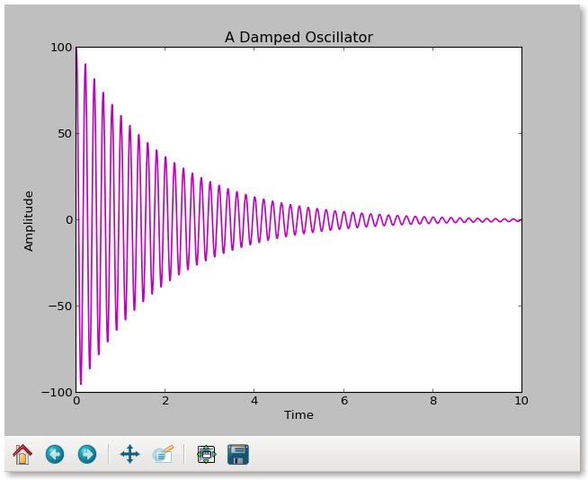
Most of this program is used to create and prepare the data lists. The plotting is done in one line! We add labels to the canvas so the new window is labeled on the screen, to the axes, a title to the plot, and show the work. The way in which it appears will depend on our installation, but the default is a Tkl interface that offers control for panning, zooming, and saving as png file. The data go into the plot as lists, and appear by default as a drawn line connecting the points. However, if you prefer red circles to a "pen down" line, then change the plt.plot to
plt.plot(time,amplitude,'ro')
or to
'r--' # red dashes
'bs'  # blue stars
'g^'  # green triangles
The properties of the line would be controlled by variables in the plot function using MATLAB-style string/value pairs.
plt.plot(time,amplitude, color='g', linewidth='2.0')
or alternatively a plot control function
 lines = plt.plot(time,amplitude)
 plt.setp(lines, color='r', linewidth=2.0)
This has the useful feature that interactively plt.setp(lines) will show you all the parameters and their values.
The data in this example are input as lists, but they could be tuples instead:
# Import the plotting and math packages
import matplotlib.pyplot as plt
import math
# Define initial constants
f0 = 5.
a0 = 100.
tdecay = 2.
# Create lists for the (x,y) data
time = []
amplitude = []
# Calculate the data and append to the lists
for i in range(0, 10000, 1):
  t = 0.001 * float(i)
  a = a0 * math.exp(-t/tdecay)*math.cos(2. * math.pi * f0 * t)
  time.append(t)
  amplitude.append(a)
x = tuple(time)
y = tuple(amplitude)
# Create an x-y plot of the data with labeled axes
plt.xlabel('Time')
plt.ylabel('Amplitude')
plt.title('A Damped Oscillator')
oscillator = plt.plot(time,amplitude)
plt.setp(oscillator, color='m', linewidth=1.5)

# Show the data
plt.show()
This is what it looks like on the screen:
Saving the plot to a file
You may include a command to save a figure as a png file by adding
 fname = 'oscillator.png'
 plt.savefig(fname)
The savefig function is sensitive to the file type in the extension, and
 fname = 'oscillator.ps'
 plt.savefig(fname,dpi=600)
would be an example of a PostScript figure set to 600 dots per inch resolution. Supported formats are intended for high quality reproduction and include eps, ps, pdf, png, and svg, among others. The resolution may be controlled within the program, or in defaults for the user's custom startup file.
Overplotting and separated plots
Matplotlib's pyplot.plot takes two arrays as arguments and is aware of several modifiers that determine how the data are plotted. When you use plot, you should be aware that implicitly it creates a figure and a subplot, and then uses these with the data you have provided. The subplot(nrows, ncols, plot_number) function allows you to make arrays of 9 or fewer plots on the same page. When you only have one plot, it is subplot(1,1,1). You are allowed to leave out the commas if the result is unambiguous, and you will sometimes see this written (lazily) as subplot(111). A second subplot on row 2 would be subplot(212) and so on.
If the pyplot.plot function is repeated, it loads another set of x-y data into the one plot, each set with its own properties. The sets can be labeled, and the labels can be turned into legends in the plot. Here's a simple example:
# Import the plotting and math packages
import matplotlib.pyplot as plt
import math
# Define initial constants
f0 = 5.
tdecay = 2.
# Create lists for the (x,y) data
time = []
sine_amplitude = []
exp_amplitude = []
product_amplitude = []
# Calculate the data and append to the lists
for i in range(0, 10000, 1):
  t = 0.001 * float(i)
  a1 = math.cos(2. * math.pi * f0 * t)
  a2 = math.exp(-t/tdecay)
  a = a1*a2
  time.append(t)
  sine_amplitude.append(a1)
  exp_amplitude.append(a2)
  product_amplitude.append(a)
# Create an x-y plot with labels
plt.xlabel('Time')
plt.ylabel('Amplitude')
plt.title('A Damped Oscillator')
plt.plot(time,exp_amplitude,'r.', label='Exponential')
plt.plot(time, product_amplitude,'b-', label='Sine', linewidth=1.5)
plt.legend()
# Show the data
plt.show()
In this case we used abbreviations for the keywords, but it is clearer to use the full text and to write, for example
plt.plot(time,product_amplitude, color='blue', linestyle = 'line', marker='None',
label='Sine', linewidth=1.5)
instead.
You may create two separate plots instead of one, in the previous example, by using pyplot this way:
# Create a figure
fig = plt.figure()
# Adjust white space between plots
fig.subplots_adjust(hspace=0.5)
# Create x-y plots of the data with labeled axes
data1 = fig.add_subplot(2,1,1)
plt.xlabel('Time')
plt.ylabel('Amplitude')
plt.title('Damping')
data1.plot(time,exp_amplitude,'r.', label='Exponential')
plt.legend()
data2 = fig.add_subplot(2,1,2)
plt.xlabel('Time')
plt.ylabel('Amplitude')
plt.title('A Damped Oscillator')
data2.plot(time,product_amplitude, color='blue', linestyle='solid', marker='None', label='Sine',
  linewidth=1.5)
plt.legend()
# Show the data
plt.show()
We added subplots with the fig.add_subplot(a,b,c) function, which can also be written without the commas if there is no ambiguity in the numbers. The (a,b,c) mean an axb grid, and the cth subplot of that grid. So 111 is simply 1 plot, but 211 is a 2x1 grid and the first plot in the grid, while 212 is a 2x1 grid and the second plot.
Other useful x-y data plotting functions
Other one-line plotting options that would create subplot(1,1,1) by default include
import pyplot as plt
plt.scatter
plt.semilogx
plt.semilogy
plt.loglog
Errorbars may be included with x and y data using
plt.errorbar(x, y, yerr=None, xerr=None)
It takes the x and y arrays, an array of y errors that defaults to None, and an array of x errors that also defaults to None.
For more information on plot and other built-in plotting types, see the pyplot documentation.
Tick marks and data ranges
You've noticed that when data are loaded as a list or tuple, the plot function automatically selects the data range for both axes, and supplies tick marks. You may add minor ticks and control their properties with
plt.minorticks_on()
plt.tick_params(which='major', length=7)
plt.tick_params(which='minor', length=4, color='r')
where the first one turns on the minor ticks (minorticks_off() is the default), and the others change their length and color.
You may also limit the range of data shown in the plot and retain the automatic tick marking by adding functions such as these after creating the plot for the example show above
oscillator = plt.plot(time,amplitude)
plt.xlim(-10.,10.)
plt.ylim(-200.,200.)
With these limits, the range of x shown will be from -10 to +10 instead of the range in the x-data, and y will be shown from -200 to +200.
Interactive plotting
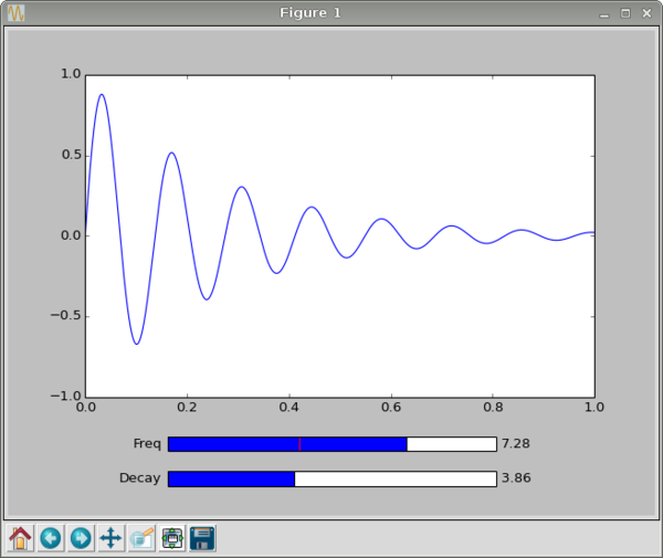
It is often useful to view a function or processing operation interactively with a graph that shows the results of changing one or more variables. This is an example written by Michael Tague, a student in the Research Methods class in 2013. We begin by setting up matplotlib and numpy in the usual way:
 import matplotlib.pyplot as plt
 import numpy as np
 from matplotlib.widgets import Slider
and you see in the last line we have added a useful "Slider" control. Next we create a series of time values as a numpy array
t = np.arange(0, 1, 0.001)
from 0 to 1 in steps of 0.001 which we take to be seconds. From this we create a matching series of amplitudes
y = np.sin(2*np.pi*t*f)/np.exp(t*d)
and a plot
p, = plt.plot(t,y)
You could stop here with "plt.show()" and be done with simple plot of the sinusoidal function. If you want to add controls to make the plot interactive, then rather than showing the plot now add adjustable subplots. The command
plt.subplots_adjust(bottom=0.25)
makes room for the sliders at the bottom of the plot. We add axes
fax = plt.axes([0.25, 0.14, 0.5, 0.03])
and a frequency Slider
fs = Slider(fax, 'Freq', 0.0, 10.0, valinit=f)
Now we create a function that updates the frequencies whenever the slider is changed
 def f_update(val):
   global f, p
   f = val
   y = np.sin(2*np.pi*t*f)/np.exp(t*d)
   p.set_ydata(y)
   plt.draw();
fs.on_changed(f_update)
The decay constant slider is the same as this, but for the decay, d, we move it down a bit.
 dax = plt.axes([0.25, 0.07, 0.5, 0.03])
 ds = Slider(dax, 'Decay', 0.0, 10.0, valinit=d)
 def d_update(val):
   global d
   d = val
   y = np.sin(2*np.pi*t*f)/np.exp(t*d)
   p.set_ydata(y)
   plt.draw();
ds.on_changed(d_update)
Now we show the interactive plot with
plt.show()

A little 3D plotting
One of the features that makes Mathematica and Matlab so useful is their built-in 3D plotting for multivariable surfaces and objects. Matplotlib does this very easily in Python, but the features are so rich we can only sample a few of them here.
As an appetizer, consider surface3d_demo2.py from matplotlib:
from mpl_toolkits.mplot3d import Axes3D
import matplotlib.pyplot as plt
import numpy as np
fig = plt.figure()
ax = fig.add_subplot(111, projection='3d')
u = np.linspace(0, 2 * np.pi, 100)
v = np.linspace(0, np.pi, 100)
x = 10 * np.outer(np.cos(u), np.sin(v))
y = 10 * np.outer(np.sin(u), np.sin(v))
z = 10 * np.outer(np.ones(np.size(u)), np.cos(v))
ax.plot_surface(x, y, z,  rstride=4, cstride=4, color='b')
plt.show()
The first line imports a toolkit that provides 3d projection. For this one, you would need the mpl_tookits package.
The second line imports matplotlib.pyplot and uses plt to stand for it in our code.
The third line imports numpy, numerical Python, which we are going to look at in more detail later. Here, it provides a way to handle the data transparently even if you do not know how the code works yet.
We create a figure called "fig", and we add one and only one subplot "ax" that will hold our work. Notice that the subplot is a "3d" projection.
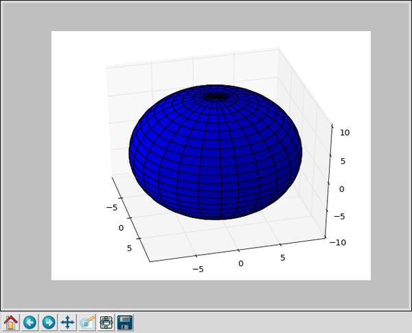
Numpy is used to create two linear arrays, one from 0 to 2 Pi that we think of as Phi, the azimuth angle in spherical coordinates. The other, from 0 to Pi, is Theta, the altitude of spherical coordinates. From these we calculate a set of x, y, and z that are the coordinates of points on a surface. Here, "np.outer" means "outer product" of two linear arrays, that is each of x, y, and z are matrices that contain the coordinates (x,y,z) of points on the unit sphere or radius 10 selected by the angles u and v.
The plotting is done in one line from the mpl toolkit with plot_surface(), and then dislayed for us to use with show().
From that little program we get an interactive 3D display of a sphere that looks like this:

There's a 3D tutorial for matplotlib from their website illustrating other examples.
Bokeh
Bokeh is a visualization library that is not part of the standard Python core distribution, is included in Anaconda or Enthought versions. If you find it is missing from your computer, the installation website will tell you how to install it.
How it works
Rather than use the windowing software of your computer's operating system, say X-windows for Linux as an example, Bokeh prepares your data in a format that can be read by Javascript, the language of your computer's browser. While this may seem a roundabout way of getting a display, it is a rather brilliant technique to leverage the power of the browser and to make graphics universal across all platforms. It is also only one step removed from turning your desktop data processing into a website where you can share your work and collaborate with others. There is an alternative, coming from the world of Javascript (perversely often written JavaScript) and the HTML5 web language, where the work is done largely in the browser and Python is used on the "server side" to do the heavy lifting on the data. This is an entirely functional approach too, and lets us use the full featured web for data processing and visualization. However it is more cumbersome, and adds other languages to the toolchain, and requires running a web server. Before we go into that possibility, we look at what can be done with Python, this library, and a browser like Chrome or Firefox.
Examples
For examples of Python illustrating plotting with matplotlib and bokeh, see the examples section.
Assignments
For the assigned homework to use these ideas, see the assignments section.
